Overview
Email marketing remains one of the most effective ways to engage with your audience and boost business growth. In this comprehensive guide, we will delve deep into the Email Builder and its Inline Editor, empowering you to streamline your email creation process and create compelling campaigns that resonate with your audience.
I. Understanding the Email Builder Inline Editor:
Introduction to Email Builder Inline Editor
The Email Builder Inline Editor is a powerful tool embedded within our Templates and Campaigns platform. It eliminates the complexity of email design and formatting, offering a user-friendly interface for effortless customization.
Leveraging "What You See Is What You Get" (WYSIWYG) Editing
This editor operates on the principle of WYSIWYG, providing real-time previews as you make changes. Whether it's bolding a sentence, inserting an image, or changing the color of a heading, the editor displays the final email appearance instantly.
Customization Features: Fonts, Text Sizes, Colors, Formatting, Hyperlinks, and More
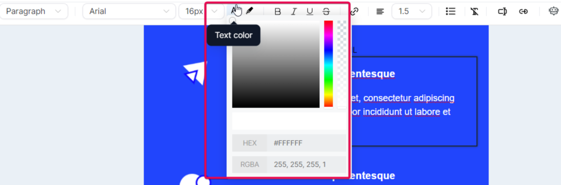
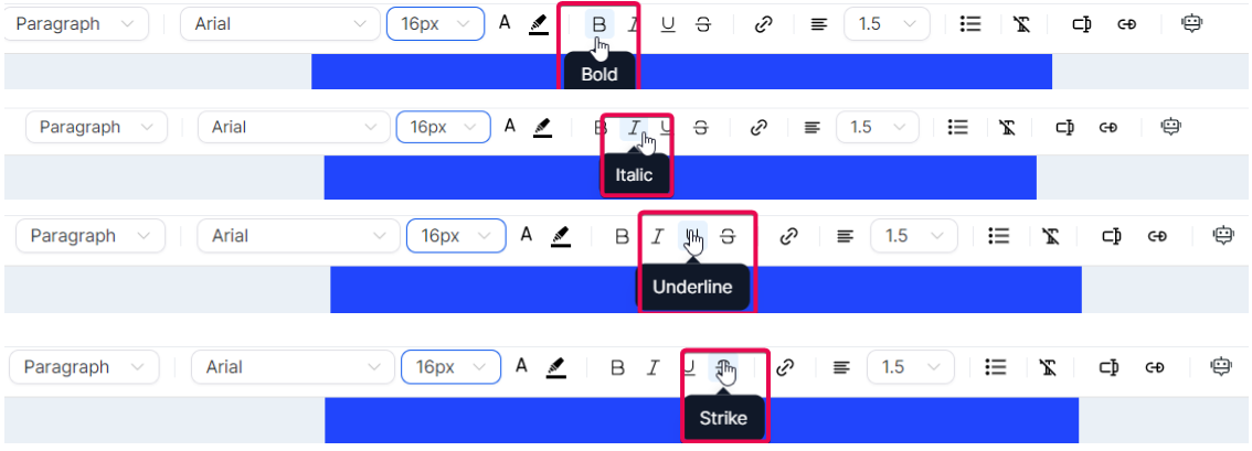
The Inline Editor supports various customization features. Users can choose from multiple heading and paragraph formats, select supported fonts, adjust text sizes, and apply colors using hex codes for precise selection. Formatting options such as bold, italic, underline, and strikethrough, along with hyperlink integration, enhance the email's visual appeal.
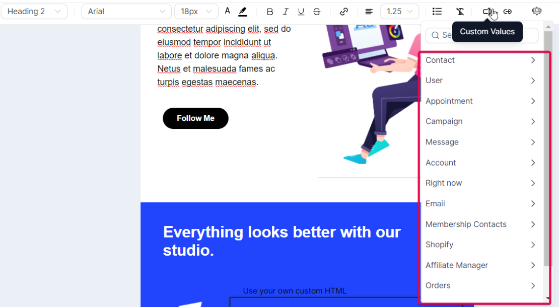
Moreover, the inline editor allows for custom values, giving you better control over your content. The tool also supports AI-assisted content generation, which can help you create engaging email content faster.
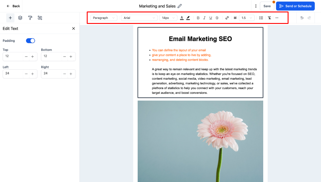
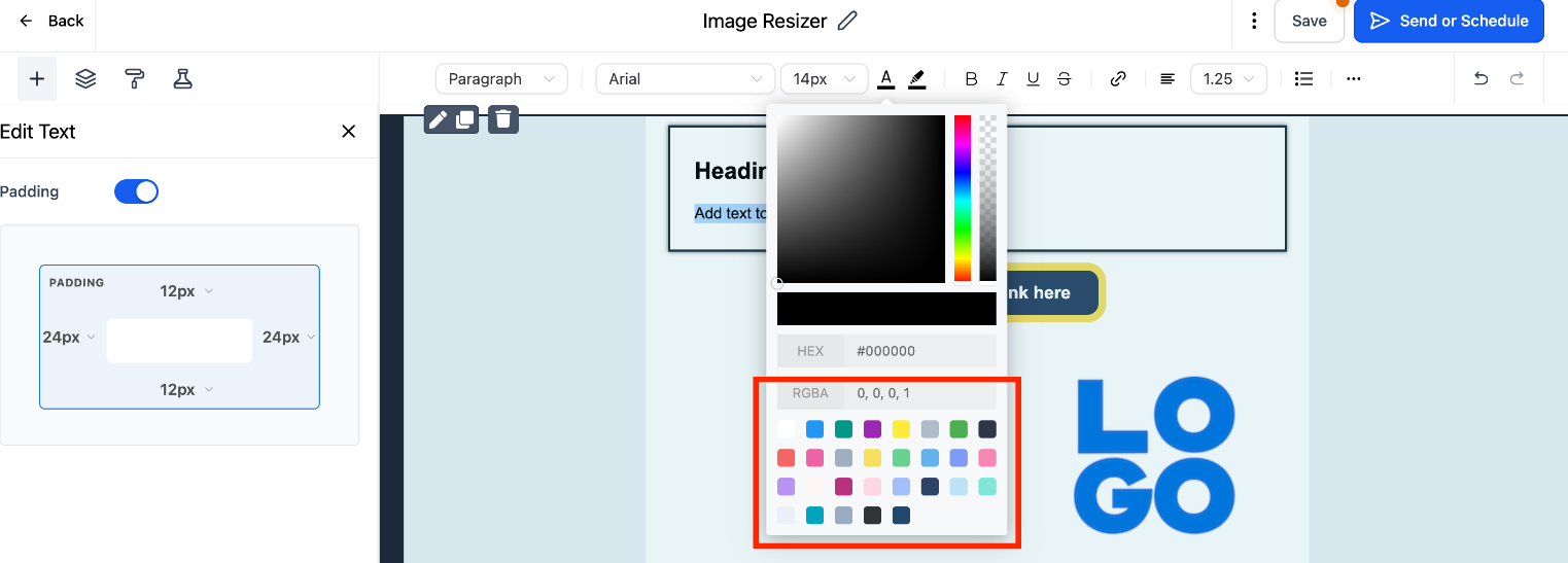
Default Padding Update for Uniformity in Email Structure
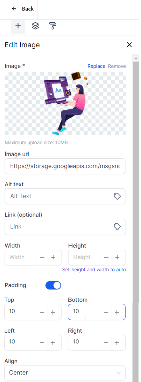
To maintain uniformity, default padding settings have been implemented. These settings include top padding (12), bottom padding (12), left padding (24), and right padding (24), ensuring consistent spacing around the content.
Top Padding: 12
Bottom Padding: 12
Left Padding: 24
Right Padding: 24
II. How to Use the Email Builder and Its Inline Editor:
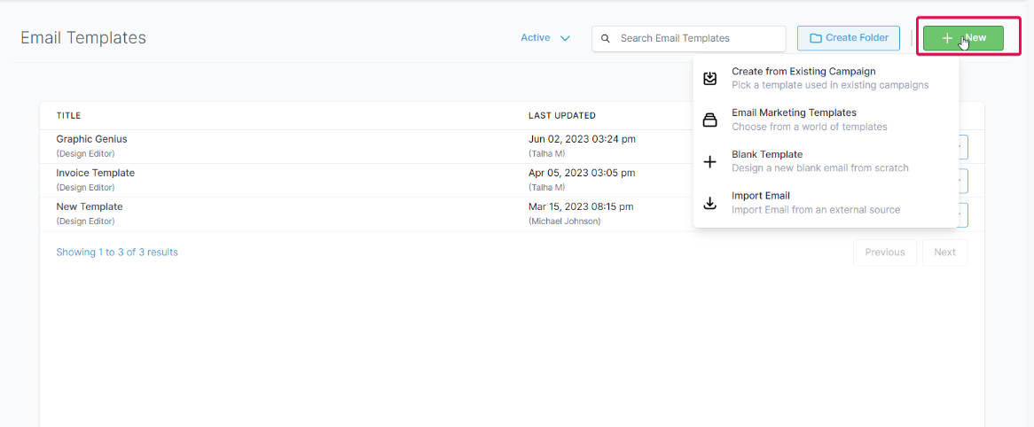
- Navigate to Marketing > Emails > Templates
- Here you can create a new template or edit an existing one.
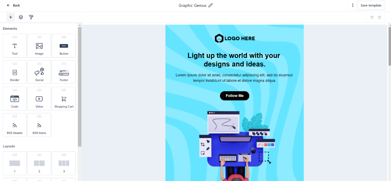
Navigating the New User Interface
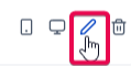
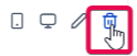
Upon accessing the Email Builder, you will be greeted by a sleek, intuitive user interface. The toolbar at the top offers essential functionalities:
- The
- The
- The
These functionalities are designed to give you complete control over your email's design, from the individual components to the overall look and feel.
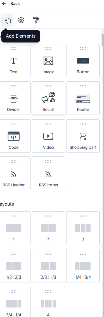
Adding Elements to Your Email
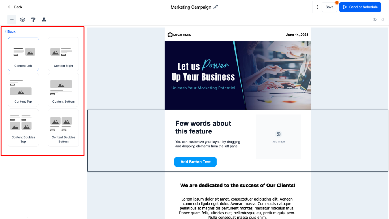
The Email Builder offers various layouts catering to diverse content needs:
- Click on the Add Elements tab to drag and drop the Layouts onto the page so you can drop the Element into any existing layout
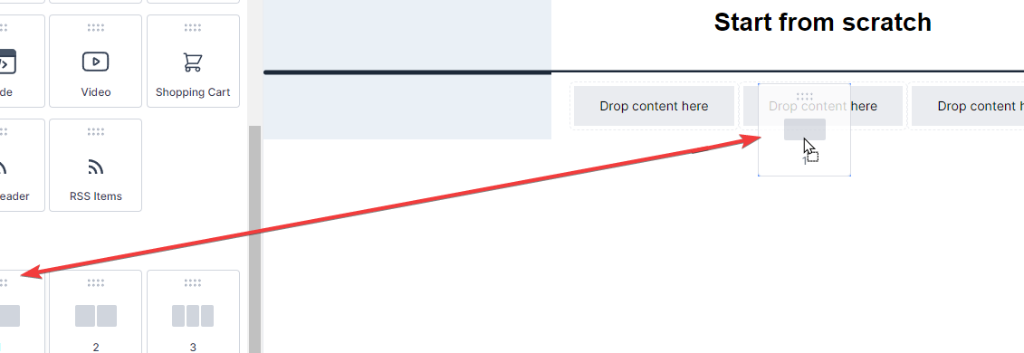
Layouts
Here's a detailed explanation of each layout:
1: This layout represents a single-column structure. All content is placed in one straight vertical line. This is the most basic and one of the most common layouts used in emails. It's great for readability, especially on smaller screens such as mobile devices.
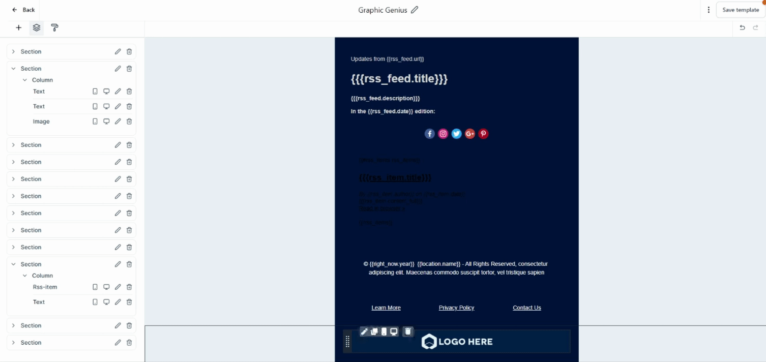
2: This layout corresponds to a two-column structure. Your email content is divided into two vertical columns. This layout is ideal for displaying two groups of content side by side, like an image and a text block or two articles from an RSS feed.
1/3: 2/3 and 2/3 : 1/3: These layouts represent a structure where the content is divided into two unequal columns. In 1/3: 2/3, one column takes up 1/3 of the width, and the other takes up 2/3. It's reversed in the 2/3: 1/3 layout. These are great for highlighting one piece of content more than the other, like an image and an accompanying description where the image is the main focus.
1/4: 3/4 and 3/4 : 1/4: Similar to the above, but here one column takes up 1/4 of the space, and the other takes up 3/4, and vice versa. This layout is useful when one piece of content is significantly more important than the other, such as a small navigation menu alongside a large content area.
4: This layout refers to a four-column structure. Your email content is split across four equal vertical columns. This is useful for presenting multiple pieces of content of equal importance side by side, like a grid of images or multiple articles from an RSS feed.
These layouts offer various ways to structure and present your content, depending on your specific needs and the type of email you're sending. By understanding the different options, you can choose the most effective layout for your email.
To add any of these elements to your email, drag and drop them onto your canvas. When you select an element for editing, the Inline Editor will pop up, providing numerous options to modify your chosen element to fit your requirements.
Elements
Here is a comprehensive list of content types you can add to your email:
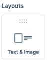
Text: This versatile element can be used for headings, paragraphs, captions, and more. With the inline editor, you can fine-tune every text aspect, from the font style to the color and alignment.
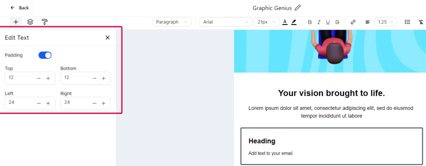
Image: If you want to include photos, graphics, or any other visual content, the Image element is the tool you need. You can upload images directly from your computer or link them from an external source.
Button: Enhance user interaction with the Button element. You can link to a webpage, start a download, or trigger any other click-based action.
Note: Enter the text you want to display on your button. For instance, you might use 'Follow Me' to invite readers to follow a link to your social media page
Divider: The Divider element allows you to introduce clear separations between different sections of your email. Customize the color, width, and style to fit your design.
Social: Want your recipients to visit your social media profiles? The Social element lets you easily include icons linked to various social media platforms.
Footer: Use the Footer element to include essential information like contact details, company address, or unsubscribe links.
Code: Need more advanced features? The Code element allows you to insert custom HTML code directly into your email. This is where you input your custom code. This allows you to create more advanced layouts and components within your email.
Note: The Code block is intended for users who are proficient in HTML. As a precaution, we recommend familiarizing yourself with the essentials of HTML before using this feature. For guidance, you might find these resources helpful:
https://www.w3schools.com/html...
https://www.codecademy.com/lea...
Video: Engage your recipients with multimedia content. Insert a Video element and link it to your hosted video content.
Shopping Cart: If you're in the e-commerce industry, the Shopping Cart element is a handy tool for including product details, pricing, and direct links to your online store. It's a way to remind them of the products they're interested in and encourage them to finalize their purchases.
RSS Header: The RSS Header block in the email builder is a powerful tool that allows you to dynamically populate the <channel> tags from your RSS Feed in your email campaign.
RSS Items: When dealing with RSS feeds, the "RSS Items" element is a crucial part of an email builder in email marketing platforms. It essentially works as a dynamic content placeholder that populates content from the RSS feed into your email campaign. The RSS items can range from blog posts, news updates, articles, or any published content accessible through an RSS feed.
FAQ Element: The FAQ element in your email allows you to create interactive accordion-style sections, providing a dynamic way to present frequently asked questions and their answers. Users can click on the accordion headers to expand and collapse the content, enhancing user experience and engagement.
Product Element: The Product element transforms your emails by incorporating visually engaging product catalogs. This feature provides a variety of benefits, from enhancing visual engagement to boosting conversion rates and strengthening brand identity.
Managing Text and Formatting
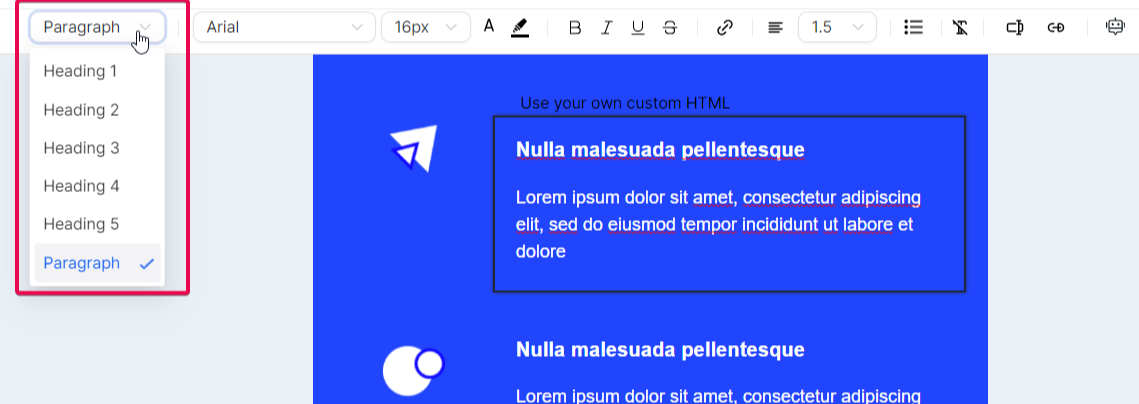
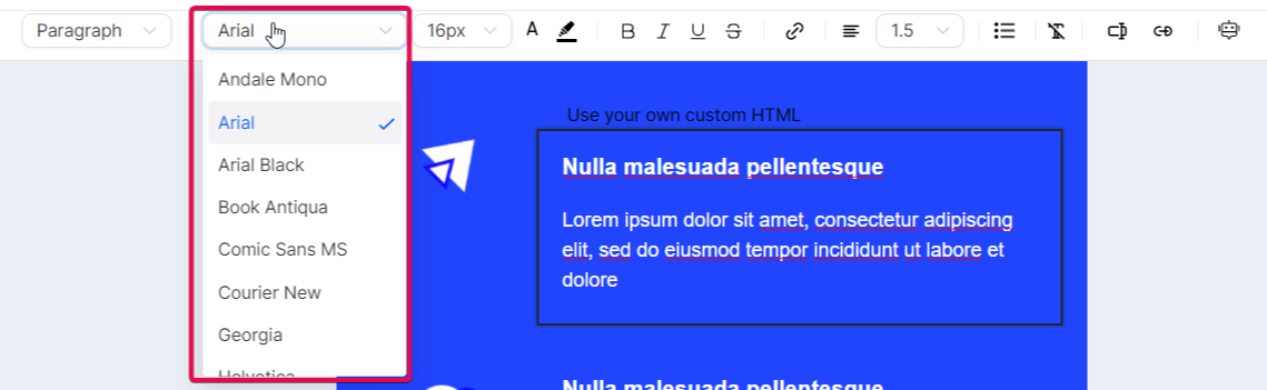
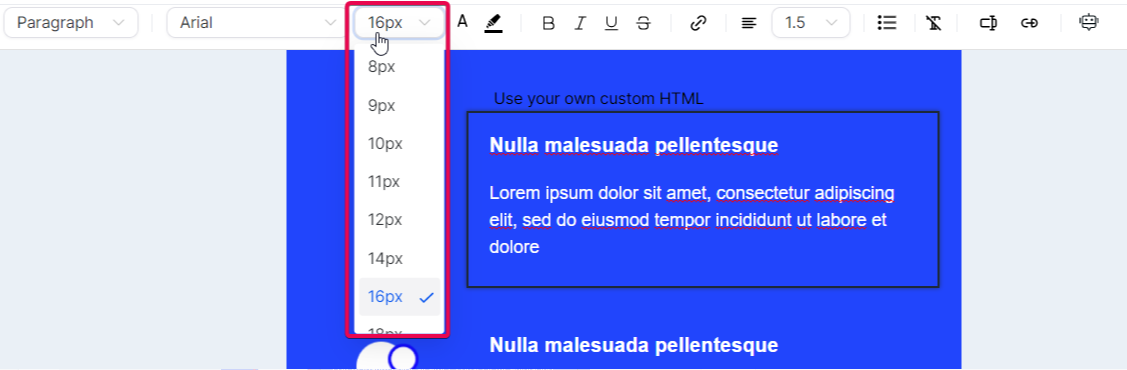
An inline editor is a powerful tool that lets you easily manage text and its formatting. When you highlight any portion of text, a range of options becomes available in the editor.
You can change the heading type.
Select a different font, adjust font size, and modify the text color
It doesn't end there - options for bold, italic, underline, and strikethrough are also available
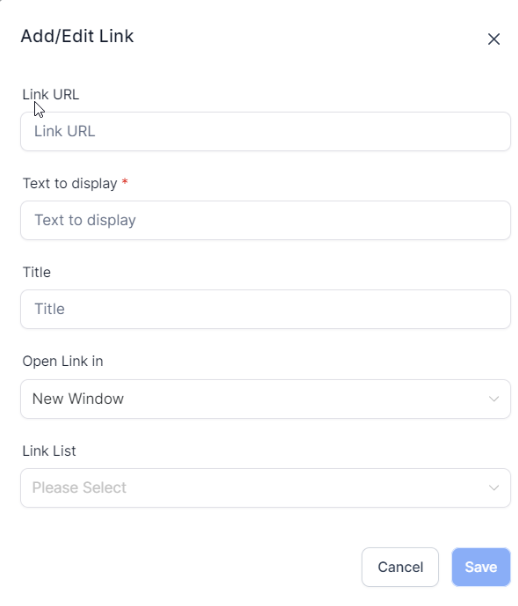
If you wish to add a hyperlink to your text, the inline editor allows you to do so, giving you control over its display text and target URL

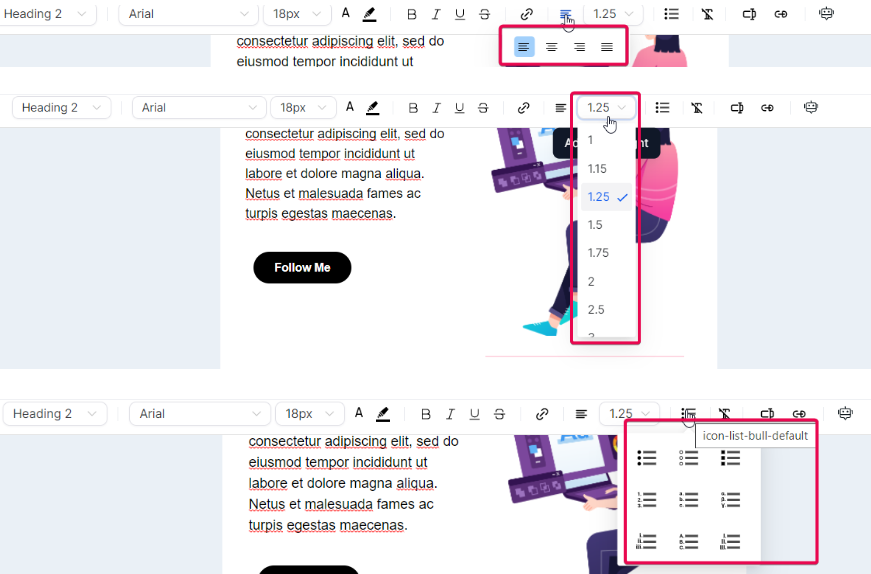
You can also adjust text alignment and line height or introduce bullet points to your text.
How to Use Image and Text Layout:
- You can access the Image and Text Layout through Marketing > Emails > Templates/Campaigns.
- You have the flexibility to choose a template or start from scratch.
- The layout option includes the ability to add images, text, and buttons together.
- Once the Image and Text Layout is added to the Builder area, select yourpreferred layout design.
- Customization options are available, including selecting padding and background colors, streamlining the email creation process.
III. Managing Elements in Email Builder:
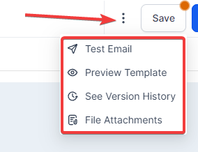
Advanced Editing Options
The inline editor also comes equipped with advanced editing options. The 'Clear Format' feature lets you strip any existing formatting from a section of the text, a handy tool when pasting text from external sources.
- Clear Format:
- Custom Values:
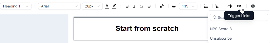
- Trigger Links:
- ContentAI:

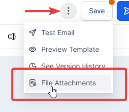
Saving and Previewing Your Email
- Versioning:
- File Attachments:
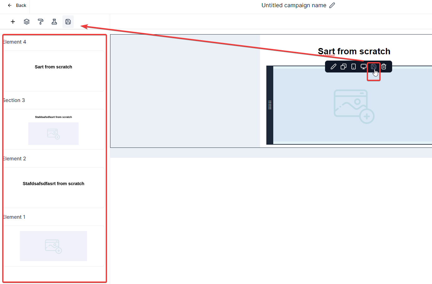
Editing and Refinement:
- Utilize options like
Further Customization:
Custom values: They bring a personalized touch to your emails by incorporating specific recipient details such as their name or location. This personalization can improve your email's relevance to each recipient, thereby improving engagement rates.
Trigger links: They allow recipients to perform certain actions directly from the email, such as confirming a subscription, unsubscribing, or accessing a special offer. These interactive elements can drive engagement and boost conversions by simplifying user actions.
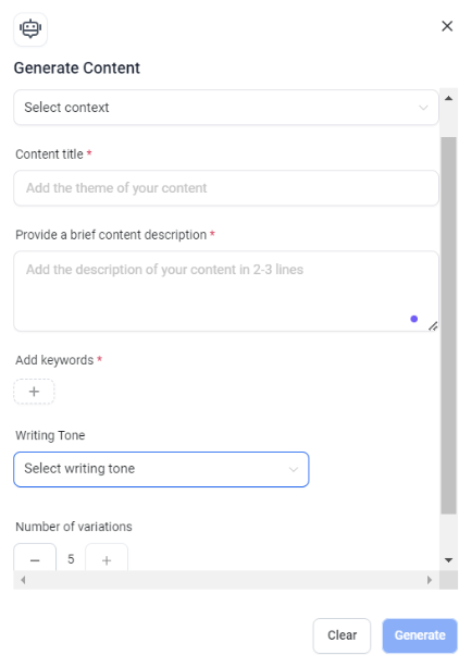
Moreover, the 'ContentAI' feature leverages artificial intelligence to help generate text content. The tool can automatically generate relevant text content for you by providing content titles, descriptions, and keywords.

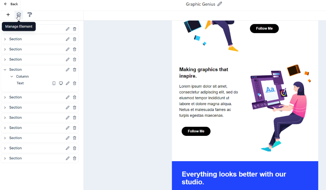
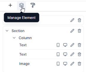
Managing Elements
The Inline Editor simplifies text management and formatting:
- Font Styles, Sizes, and Colors:
- Text Formatting Options:
- Hyperlinks and Alignment:
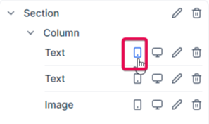
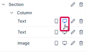
The 'Manage Elements' function gives you control over each element within your email. Selecting an element in this section allows you to modify its visibility for different devices - desktop, mobile, or both.
Visibility settings allow you to control how certain elements appear on different devices. Specifically, "mobile visibility" and "desktop visibility" settings allow you to choose which elements of your email or webpage should be displayed when viewed on a desktop or mobile device.
Mobile Visibility refers to how your email or webpage elements appear on mobile devices like smartphones or tablets. Given the smaller screen sizes of these devices, you might opt to hide certain elements that don't display well or simplify your content for easier mobile consumption. It can also involve restructuring or resizing elements for a more mobile-friendly layout.
Desktop Visibility refers to how your email or webpage elements are viewed on desktop devices. Since desktop screens are larger and provide more space, you can include additional elements that wouldn't fit well on a mobile screen. Also, elements that require hover actions, which are not applicable on mobile devices, can be displayed.
Moreover, each element can be edited independently, allowing you to change its properties.
You can remove an element from the 'Manage Elements' section if it doesn't fit into your email.
Whenever you hover over and click a section, column, or element in the Manage Elements section, the screen scrolls to the section, column, or element you are hovering your cursor over.
IV. Adjusting Appearance and Styling:
The 'Appearance' function is your go-to place for tweaking your template's look and feel.
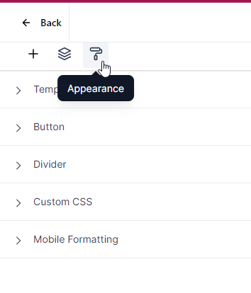
Color Swatch Picker and Template Customization
The Text Editor Color Picker allows effortless selection from preset colors. Template customization options include:
Color Scheme: Users can choose a suitable color palette for the template.
Background Image: Templates can be enhanced with background images, adding visual appeal.
Email Width Definition: Defining the width ensures content displays optimally on various devices.
Color Swatch Picker
With the Text Editor Color Picker you can quickly choose from a selection of preset colors
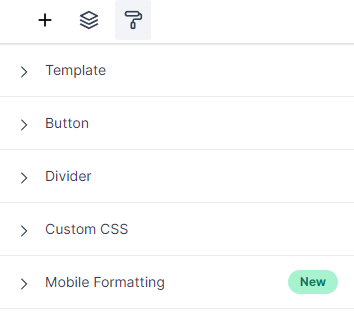
Styling Action-Oriented Elements and Dividers
The appearance settings include specialized sections for interactive elements and content segregation:
- Button Styling:
- Divider Customization:
- Custom CSS:
Template:
Here you can choose the color scheme for your template, upload a background image, and even define the width of your email's content.
Button:
The "Button" section in the appearance settings allows you to design and stylize action-oriented buttons for interactive and engaging emails.
Divider:
The "Divider" section in the appearance settings lets you incorporate customized lines for structuring and segregating email content.
Custom CSS:
The "Custom CSS" section allows you to add CSS styles to customize your email layout further. However, this requires a good understanding of CSS and its implications in email design. CSS in emails works slightly differently than in web design due to the variety of email clients and their rendering capabilities.
Here are a few resources that can help you get started with CSS:
CSS Tricks: https://css-tricks.com/
- This website provides a wealth of information about CSS and how to use it effectively, including many articles specifically about using CSS in email.
Litmus: https://litmus.com/blog/catego...
- Litmus is a well-known email testing tool, and its blog features many in-depth articles about email coding, including CSS.
Smashing Magazine: https://www.smashingmagazine.c...
- An Introduction To Building And Sending HTML Email For Web Developers: This guide provides a comprehensive overview of HTML and CSS in emails.
MDN Web Docs: https://developer.mozilla.org/...
- Using CSS: Mozilla's developer network is a trusted resource for web developers. This guide explains how to use CSS custom properties, which can be useful in your custom CSS block.
Email Design Workshop: CSS in Email: https://emaildesign.beefree.io...
- This guide provides a clear overview of the basics of using CSS in email.
Can I email…: Like Can I use… but for email: https://www.caniemail.com/
A great resource for checking which CSS properties and HTML elements are supported by major email clients.
V. Mobile Formatting Best Practices:
Configuring Mobile Emails
Key considerations include:
- Single-Column Layout:
- Image Optimization:
- Touch-Friendly Buttons:
- Concise Text and Clear CTAs:
- Responsive Email Design:
- Preview and Testing:
- Incorporating White Space:
- Font Size and Accessibility:
Mobile Formatting
In today's world, it's important that your emails look good on all devices. With that in mind, the Email Builder Inline Editor provides a special section for mobile formatting.
Here, you can specify which headings, paragraphs, and buttons should be visible when your email is viewed on a mobile device. This ensures that your emails are optimized for both desktop and mobile viewing.
Email Mobile View Configuration Best Practices:
When configuring mobile emails, you need to pay close attention to a few key areas that contribute to the overall usability and effectiveness of your emails:
- Use a Single-Column Layout:
- Optimize Images:
- Touch-Friendly Buttons:
- Limit Text Amount:
- Use a Responsive Email Design:
- Preview and Test:
- Include White Space:
- Font Size and Style:
- Clear and Concise CTAs:
- Optimize Subject Lines and Preheader Text:
- Opt for Plain Text Over Images:
- Unsubscribe Option:
- Accessibility:
Remember, the best practices for mobile email configuration may vary depending on your specific audience and the type of content you're sending. Always test different approaches to see what works best for your audience.
Here are some resources that could help further consolidate the mobile email design best practices:
Mobile Email Design Further Reading: https://www.emailonacid.com/bl...
Utilizing Colors in Email Design Further Reading: https://www.creativebloq.com/i...
Optimize Images for Mobile Use Further Reading: https://www.sendinblue.com/blo...
Tips for CTA Design Further Reading: https://unbounce.com/email-mar...
Best Use of Space Further Reading: https://stripo.email/blog/emai...
Best Use of Scroll Further Reading: https://www.campaignmonitor.co...
Is A/B Testing Emails Necessary? Further Reading: https://sendpulse.com/blog/ab-...
Accessibility Guidelines for Emails Further Reading: https://www.emailonacid.com/bl...
Mobile-friendly Vs. Responsive Email Design Further Reading: https://litmus.com/blog/unders...
Mobile Email Configuration Best Practices Further Reading: https://www.mailup.com/resourc...